
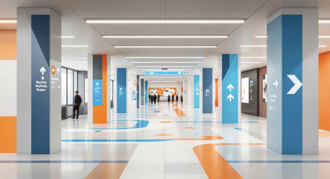
Navigating a complex physical facility—such as a multi-floor medical building, corporate office campus, or university building—should feel seamless and effortless for visitors. However, when architectural layouts lack intuitive directional cues, guests quickly become disoriented, frustrated, and delayed. Effective architectural wayfinding relies on strategic information design to guide people smoothly from outdoor parking entrances to their exact interior destinations. Implementing a structured directional system reduces visitor stress, lowers operational demands on front-desk staff, and improves overall physical safety across your property.
Developing a functional wayfinding system requires looking at an entire property through the eyes of a first-time visitor. Visual elements like main entrance directories, overhead directional arrows, and room identification signs must present information clearly, in logical sequence, and at comfortable viewing distances. Facility administrators and architects routinely examine signage standards developed by commercial visual specialists like AlphaGraphics Charleston to ensure directional maps comply with accessibility guidelines and spatial best practices. Understanding how human psychology and spatial design interact allows property owners to create welcoming, easy-to-navigate environments.
The Core Components of an Effective Wayfinding Framework
A complete physical navigation system relies on four primary types of signage, each serving a distinct operational purpose along the visitor’s journey.
- Identification signs: Mark specific destinations, such as main entrances, room numbers, restrooms, emergency exits, and designated department zones.
- Directional signs: Positioned at decision points like hallway intersections, stairwell landings, and elevator lobbies to guide continuous forward movement.
- Informational signs: Provide general background context about the facility, including operating business hours, facility rules, and security guidelines.
- Regulatory signs: Communicate safety compliance mandates, emergency evacuation routes, and restricted access areas.
Best Practices for Designing Wall Directories and Maps
Lobby directories serve as the primary navigational hub of any building. If a main directory map is overcrowded, unorganized, or hard to read, the rest of the navigational system struggles to compensate.
1. Group Information Logically
Rather than listing dozens of office names in random order, organize tenant listings alphabetically or categorize them logically by floor level and wing section.
2. Prioritize Spatial Orientation
When presenting “You Are Here” floor plan maps, orient the map perspective to match the exact direction the viewer is facing. Reversing map perspectives forces visitors to perform mental rotations, increasing navigational confusion.
3. Maintain High Visual Contrast
Ensure text fonts and directional icons stand out sharply against background panels. Dark lettering against light backgrounds or bright white text on dark gray panels ensures maximum readability under changing hallway lighting conditions.
Key Principles of Readability and Accessibility Standards
Designing building signage requires adhering to universal accessibility standards to accommodate all visitors, including individuals with visual or physical impairments.
Typography and Font Scaling Guidelines
- Use clean typography: Select simple, unadorned sans-serif fonts with equal stroke weights. Avoid decorative script fonts that degrade readability from a distance.
- Scale font height to distance: Ensure directional text uses font sizes large enough to read comfortably while walking. As a rule, use one inch of letter height for every ten feet of viewing distance.
Incorporating Accessibility Features
Complying with accessibility regulations (such as ADA standards in the United States) ensures that all building occupants can navigate safely.
- Mounting heights: Position room identification signs adjacent to doors at a standardized height—typically between 48 and 60 inches from the finished floor to the baseline of the text.
- Tactile lettering and Braille: Include raised tactile characters and corresponding Grade 2 Braille along lower borders of room markers for visually impaired guests.
- Non-glare surfaces: Finish signs with matte or satin coatings to prevent glare from overhead fluorescent lighting or direct sunlight.
A Step-by-Step Approach to Auditing Your Building Navigation
Improving an existing property’s visual direction requires a practical walk-through assessment.
Step 1: Map the Visitor Journey
Identify all primary access points where guests arrive, including main parking structures, transit drop-offs, and lobby entrances. Document every key destination a visitor might search for within the building.
Step 2: Identify Critical Decision Points
Walk each pathway slowly and mark every location where a visitor must make a physical choice—such as turning down a hallway corridor, selecting an elevator floor, or choosing between stairs. Ensure clear directional indicators exist at every single decision node.
Step 3: Remove Redundant Visual Noise
Too many signs cause visual fatigue, leading visitors to ignore critical warnings altogether. Consolidate overlapping notices into unified, well-organized displays to maintain clean sightlines throughout your corridors.
Maintaining Your Visual Navigation Infrastructure
Wayfinding is an ongoing facility management process rather than a one-time project. As tenants move, room uses change, or departments expand, update main lobby directories and hallway markers immediately to prevent outdated information from confusing guests. Conducting annual navigational audits ensures your physical building environment remains structured, accessible, and effortlessly simple for every visitor who walks through your doors.